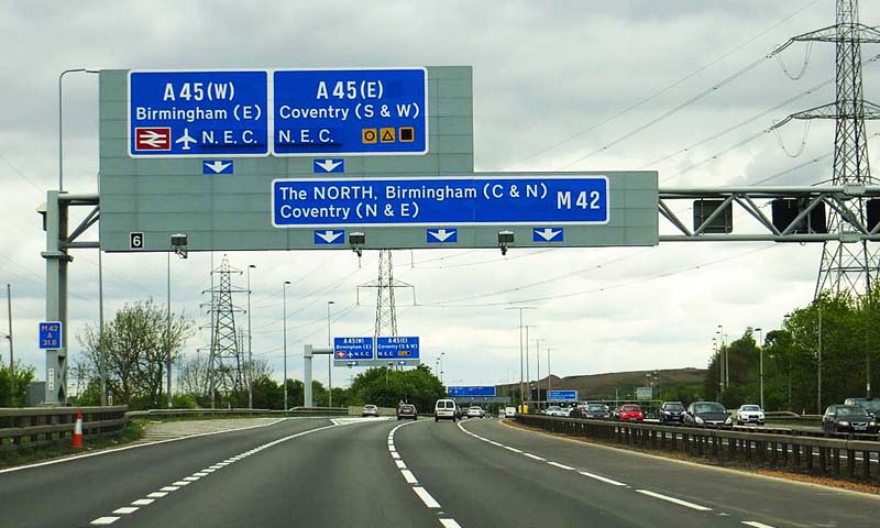
Motorway Signs
The UK’s first significant stretch of motorway comprised the M1’s junctions 5-18, opened in 1959, though the M6 in Preston had a small section opened the previous year. With no speed limit and unschooled drivers treating these straight, wide roads as race tracks even in fog, there were thousands of crashes in those early days. One issue was the clarity of signage, which obviously had to be read and understood at speed.
This led to several years of experimentation and debate before the optimal designs and standards were selected for motorway signs. The Road Research Laboratory tested different ideas in Hyde Park, Slough and part of the M1, among other places. The Anderson Report of 1962 was expanded on by the Worboys Report of 1963 and both of these Committees employed the services of graphic designers Richard ‘Jock’ Kinneir (1917-94) from Hampshire and S.African émigrée Margaret Calvert (1936-).
Their recommendations included having a blue background behind reflective white, mixed-case lettering, for which they designed a new typeface called ‘Transport’ (this is also now used on the government website). This aids word-shape recognition and best use of space. Kinneir and Calvert went on to design all other British road signs, using pictograms instead of text wherever possible.
(Image: Steve Daniels at geograph.org.uk / CC BY-SA 2.0)